Details Customization
The Spell Details Customization dialog is a per-user configuration menu. It controls which UI buttons and metadata fields appear on spell rows and in the sidebars of the Player Spell Book and the Spell List Manager, and it sets the wizard book icon color and the sidebar controls position.
All toggles are stored as individual client-scope settings, so every user can configure their own view without affecting other players or the GM.
Opening the Dialog
Section titled “Opening the Dialog”The dialog is registered as a settings menu named spellDetailsCustomization and is not restricted, so both players and GMs can open it. It can be reached from three places:
- Game Settings -> Configure Settings -> Spell Book -> Configure Display (paint-palette icon).
- The palette button in the Spell List Manager footer.
- The Configure Display button in the global fieldset of Spell Book Settings (the per-actor dialog). When the Spell Book Settings window has been detached, the Details Customization window opens into the same detached instance.
Dialog Layout
Section titled “Dialog Layout”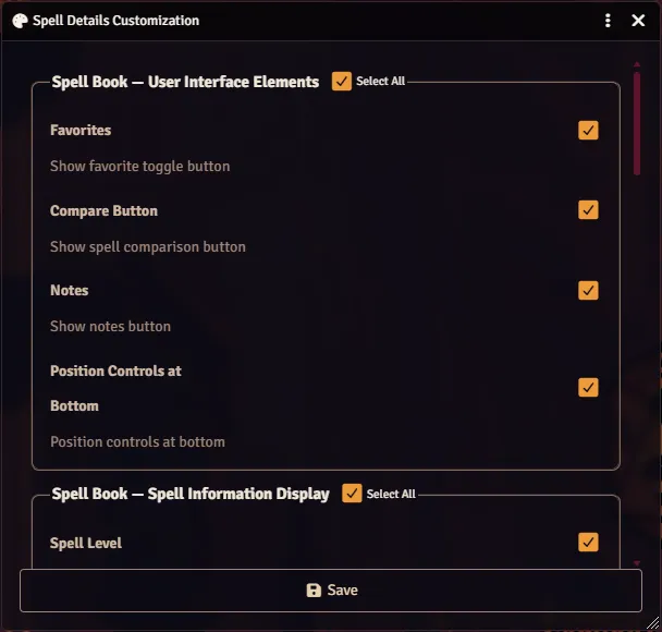
The dialog uses the standard-form pattern with one fieldset per section. Each fieldset contains a Select All checkbox in its legend that toggles every member checkbox in the group on or off. The select-all also reflects an indeterminate state when only some members are checked.
GMs see the two Spell List Manager fieldsets in addition to the player fieldsets. Non-GM users see only the player fieldsets and the color picker.
Spell Book -> User Interface Elements
Section titled “Spell Book -> User Interface Elements”Controls buttons rendered on each spell row in the Player Spell Book and a layout flag for the sidebar.
| Toggle | Setting Key | Effect |
|---|---|---|
| Favorites | playerUIFavorites | Shows the favorite toggle button on spell rows |
| Compare Button | playerUICompare | Shows the spell comparison button on spell rows |
| Notes | playerUINotes | Shows the notes button on spell rows (see Spell Notes) |
| Position Controls at Bottom | sidebarControlsBottom | Moves sidebar controls to the bottom of the sidebar |
Spell Book -> Spell Information Display
Section titled “Spell Book -> Spell Information Display”Controls which metadata fields are joined into the subtitle shown beneath each spell name. Enabled fields are joined with a bullet separator in the order listed.
| Toggle | Setting Key |
|---|---|
| Spell Level | playerUISpellLevel |
| Spell Components | playerUIComponents |
| School of Magic | playerUISchool |
| Casting Time | playerUICastingTime |
| Range | playerUIRange |
| Damage Types | playerUIDamageTypes |
| Conditions | playerUIConditions |
| Saving Throw | playerUISave |
| Concentration | playerUIConcentration |
| Material Components | playerUIMaterialComponents |
Spell List Manager -> User Interface Elements (GM only)
Section titled “Spell List Manager -> User Interface Elements (GM only)”| Toggle | Setting Key | Effect |
|---|---|---|
| Compare Button | gmUICompare | Shows the spell comparison button in the Spell List Manager |
Favorites and Notes are intentionally unavailable on the GM side.
Spell List Manager -> Spell Information Display (GM only)
Section titled “Spell List Manager -> Spell Information Display (GM only)”Mirrors the player metadata list with independent gmUI* storage so the GM’s Spell List Manager view is independent from their own Spell Book view.
| Toggle | Setting Key |
|---|---|
| Spell Level | gmUISpellLevel |
| Spell Components | gmUIComponents |
| School of Magic | gmUISchool |
| Casting Time | gmUICastingTime |
| Range | gmUIRange |
| Damage Types | gmUIDamageTypes |
| Conditions | gmUIConditions |
| Saving Throw | gmUISave |
| Concentration | gmUIConcentration |
| Material Components | gmUIMaterialComponents |
Wizard Book Icon Color
Section titled “Wizard Book Icon Color”A color picker that sets the fill color of the wizard book icon used throughout the module. Stored in the wizardBookIconColor client setting (nullable ColorField).
- Use User Color button: copies your Foundry user color into the picker.
- Reset button: restores the picker to the currently saved value.
- Leaving the field blank clears the override and falls back to the default icon color.
Saving
Section titled “Saving”Clicking Save writes every toggle to its respective client setting and closes the dialog. After saving, the dialog calls refreshDisplay() on every open SpellBook and SpellListManager application instance. That refresh re-reads getEnabledPlayerElements / getEnabledGMElements and invalidates any cached formattedDetails, so changes take effect immediately without needing a reload.
Scope and Persistence
Section titled “Scope and Persistence”- Every toggle is an independent
client-scopeBooleanField. wizardBookIconColoris a nullableColorField.- Because all settings are client-scoped, each user’s customizations persist across sessions but never propagate to other users.